I know. I know. It's a little too soon to bring out the Christmas art, but this is the first thing that came to my mind for the word "round." If I have some extra time, I might even do a version in blue. And for all you parents out there, here's a black and white version that your kiddos can color:
Saturday, November 26, 2011
round
Wednesday, November 16, 2011
silent
 I feel like silence definitely plays a huge role in a mime's performance. . it makes you focus more on his/her actions. This is probably going to be a popular topic for Illustration Friday's "silent", but hey. . .I've always wanted to draw a mime :)
In other news, I've been working on my story "Attack of the Space Chickens" for the picture book class and have pretty much figured out the layout. Through the process of planning out my pages, I learned so much about the design of a picture book. Some of these lessons include:
--You can use the gutter (that's the fold in the center of the book) to your advantage by emphasizing the division of two groups. Here's a great example from Wave by Suzy Lee
Notice how the girl and the waves are separated by the gutter, acting as a natural divide.
--Avoid having two full page illustrations side by side, because they end up competing for attention. Instead, make one illustration the primary focus (i.e. the full page image) and break down the other into "spot" illustrations (i.e. smaller drawings on white space). See if you can spot where I use this principle in my "Attack of the Space Chickens" layout.

Next step: turn two spreads into full illustrations *gulp* Wish me luck ;)
Wednesday, November 9, 2011
stripes
I couldn't help it. . .November always makes me hunger for pie. Especially pies with stripes. . I think the traditional term is "lattice top." I like "stripy pie" better :)
Being 2nd generation Taiwanese, my parents never went the traditional route with Thanksgiving. Last year, we had Peking Duck. This year, I think we'll have sushi. Still, pie will always be part of the occasion. . even if it's me picking one up at the local Safeway. With my newly discovered gluten allergy, we'll have to be a little more creative. I'll let you know how it goes.
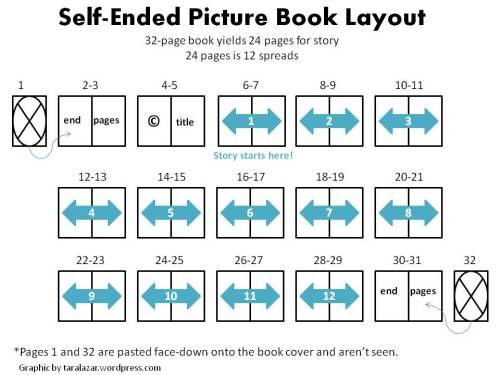
Art-wise, things have been crazy. The picture book is progressing well and I'm taking a picture book class taught by an art director of Chronicle Books. One lesson for all you illustrators out there. . .did you know that the end pages of a book can really screw with your page count!? Click on the image below to learn more.
I highly recommend taking a look at the difference between "separate/colored" and "self-ended" pages before planning out your book. . lesson learned, lesson learned lol.
Subscribe to:
Comments (Atom)


