Wednesday, December 21, 2011

sink

Let's continue with the holiday theme with this poor little penguin.  It's hard to sing well when you're sinking into snow :(

And oh, looky here, another coloring page for you guys:


It's in a weird size but that's part of the fun!

As for picture book tips, we had our last day in class and it was amazing seeing all of my classmate's final projects.  Along with two finalized illustrations, we submitted a manuscript, cover letter, and dummy for our picture books.

If you're wondering, a dummy is a very rough mockup of your entire picture book.  Yellapalooza has a great site that goes into detail about making a proper dummy book.  This is what mine ended up looking like:
I spent a little extra money to get it stapled and printed professionally, but some dummies can be as simple as black and white print outs taped back to back.  A dummy is basically there to help you get a sense of your book's overall pacing and rhythm (for both the words and the illustrations).  I found the process very helpful!

I probably won't be updating until next year, so I hope everyone has a wonderful holiday season.  See you on the other side folks :)

Saturday, December 10, 2011

separated

Cats are sneaky. . .I've always been on my guard around them. . and here's a reason why!  The poor snowman got separated from his own body :(

And here's another coloring holiday treat:
Feel free to share your masterpieces in the comments section!

As for picture books, here are a few very helpful resources:
--Picture This:  a blog created by a group of well known and respected illustrators in the industry.  It's always chock full of recent picture book news.
--Love Sketch Books:  this is a blog started by my talented classmate Sungyeon.  The blog showcases gorgeous picture books from all over the world. 

So tip of the day: peruse these blogs and get inspired!

Thursday, December 8, 2011

brigade

This is the final scene from a story I'm working on for the picture book class.  Here, Captain Cluck's brigade of pigships brings back their farm animal captors and sets them loose on their own version of paradise.  Check out the corn river and mud fountains. . sweeeet.

During the past few weeks, this illustration went through several iterations:
I first roughly mapped out the composition in pencil.

Here was my color study.  This basically helped me figure out my palette and saturation levels for the piece.

This was my first painted draft.  With feedback, I ended up taking away the sun and moving the background scene lower because they were pulling focus away from the middle and foreground.  Also, the monitor screen and font were in an awkward position and style, so that was also changed.

I can't emphasize how important it was to have my classmates' feedback throughout this process.  They really helped me tighten up the composition.  My friends at the Illopond helped me many times as well.  I'm still not sure if it's quite finished, but I definitely think the illustration has come a long way.

So I guess that's my picture book tip for the week: revise revise revise. . and in between, get feedback from people you respect and trust!

Saturday, November 26, 2011

round


I know. I know.  It's a little too soon to bring out the Christmas art, but this is the first thing that came to my mind for the word "round."  If I have some extra time, I might even do a version in blue.  And for all you parents out there, here's a black and white version that your kiddos can color:

I missed picture book class this week, but I definitely have a few more tidbits to share.  Remember how I mentioned Suzy Lee's book "Wave"?  Well apparently it's a part of a series.  They're all wordless books that are filled with gorgeous illustrations and creative concepts.  You can check out all her books here!

Wednesday, November 16, 2011

silent

I feel like silence definitely plays a huge role in a mime's performance. . it makes you focus more on his/her actions.  This is probably going to be a popular topic for Illustration Friday's "silent", but hey. . .I've always wanted to draw a mime :)

In other news, I've been working on my story "Attack of the Space Chickens" for the picture book class and have pretty much figured out the layout.  Through the process of planning out my pages, I learned so much about the design of a picture book.  Some of these lessons include:

--You can use the gutter (that's the fold in the center of the book) to your advantage by emphasizing the division of two groups.  Here's a great example from Wave by Suzy Lee
Notice how the girl and the waves are separated by the gutter, acting as a natural divide.

--Avoid having two full page illustrations side by side, because they end up competing for attention.  Instead, make one illustration the primary focus (i.e. the full page image) and break down the other into  "spot" illustrations (i.e. smaller drawings on white space).  See if you can spot where I use this principle in my "Attack of the Space Chickens" layout.


Next step: turn two spreads into full illustrations *gulp*  Wish me luck ;)

Wednesday, November 9, 2011

stripes

I couldn't help it. . .November always makes me hunger for pie.  Especially pies with stripes. . I think the traditional term is "lattice top."  I like "stripy pie" better :)

Being 2nd generation Taiwanese, my parents never went the traditional route with Thanksgiving.  Last year, we had Peking Duck.  This year, I think we'll have sushi.  Still, pie will always be part of the occasion. . even if it's me picking one up at the local Safeway.  With my newly discovered gluten allergy, we'll have to be a little more creative.  I'll let you know how it goes.

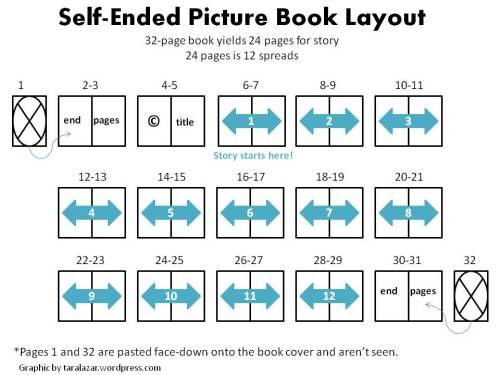
Art-wise, things have been crazy.  The picture book is progressing well and I'm taking a picture book class taught by an art director of Chronicle Books.  One lesson for all you illustrators out there. . .did you know that the end pages of a book can really screw with your page count!?  Click on the image below to learn more.
I highly recommend taking a look at the difference between "separate/colored" and "self-ended" pages before planning out your book. . lesson learned, lesson learned lol.

Sunday, October 30, 2011

scary

Cute and scary. . that's how I roll :).  For a Halloween treat, I'm sharing this Pudgy Puppy Zombie Dog coloring page that you can print out and scribble on.  If you think you or your little one creates a masterpiece, feel free to share it in the comments section.

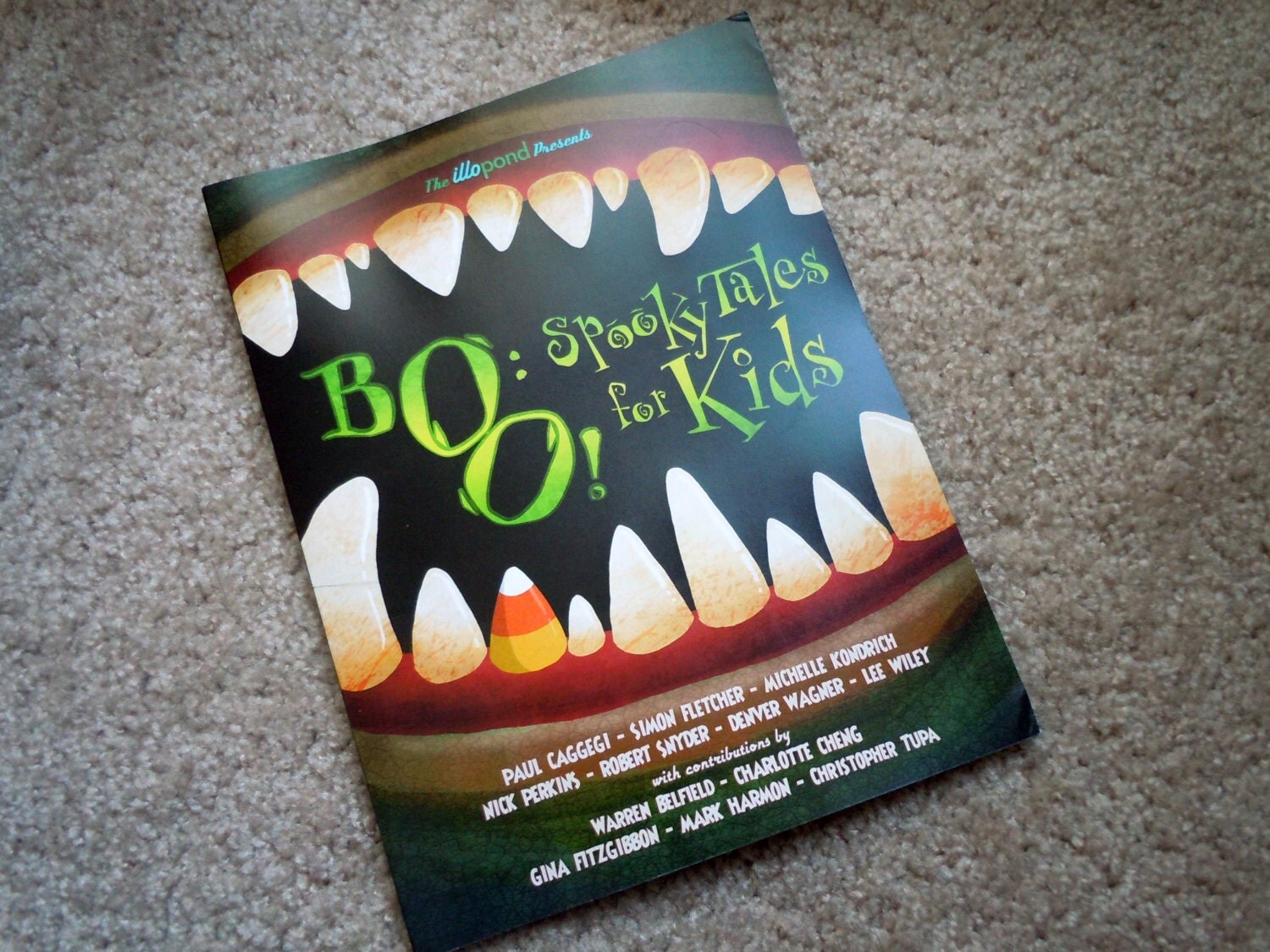
Speaking of Pudgy Puppy, remember Illopond's spoooky anthology?  If you want to read a few gorgeously drawn and creatively written stories, accompanied with a personalized doodle, just click on the image below:

Thursday, October 27, 2011

fuel

Sorry folks.  It's busy busy here so this illustration is A LOT more rough than usual.  However, I thought the concept was too fun to let slip by. . squirrels fueling their own Jack O' Lantern. . tee hee.

Maybe I'll clean it up in the future. . play around with perspective/colors a little more. . we'll see.
Until then, ever wonder what I sound like?  You can hear me geek out over our APE experience at this month's pondCAST:
Warning:  I sound like an auto-tuned chipmunk

Wednesday, October 19, 2011

scattered

When searching for an item within a gigantic grandma purse, you often end up with all its contents scattered across the nearest surface.  I am always amazed at what comes out of my grandmother's purse. . .dried mushrooms, scraps of paper, jade figurines.  Who knows how she keeps track of everything.

I'm playing with a more limited palette this time because it seemed to somehow fit this week's Illustration Friday better. It was definitely a challenge since I looove color so much.

In other news, I recently did a piece for my friend's wedding site.  Her husband-to-be is over a foot taller than her so we thought we'd play up their height difference:

Once again, I used a limited palette and I think it came out pretty well! I'll be doing another piece for their RSVP mailers soon.  So fun :)

Wednesday, October 12, 2011

contraption

I was watching Mythbusters this week and they tried to recreate the pendulum contraption based on Newton's laws.  I figured a nerdy squirrel would have to resort to more natural materials if he wanted to build a similar contraption.

Spooky Apple Lanterns aside, I know you want to read some awesome spooky tales created by awesomely talented people:


Click on the picture if you're awesome ;)

Thursday, October 6, 2011

hibernate

 
Did you know that Mushroom Bunnies gather Bendigo Jellynuts to prepare for hibernation?  I'm totally making this stuff up as I go. . but I'm thinking of fleshing out this mushroom bunny with a few more illustrations.  Any suggestions on activities/settings for him are welcome!

I had a blast at APE last weekend, finally meeting my fellow Illopond collaborators for the first time :)  Michelle Kondrich, Denver Wagner, Sam Kirkman, and I were there to promote our anthologies, including our most recent one called "Boo! Spooky Tales for Kids"

Would you like a copy? Signed by me?  With a personal sketch?  Why, look at that. . .I still have a few copies left at my Etsy shop :)  First person to order it and mention my blog in the Etsy comments section also gets a free sketch card!

Monday, September 26, 2011

ferocious

Captain Cluck is one ferocious space chicken, and his fleet of Eggsilon pigships is heading towards Earth with a very top secret mission.  Who knows what they want or what they're after!

This is a new story I'm working on for Illopond's upcoming anthology: "8 in Spaaace!"  I'm pretty excited about where it's heading and will be trying out this painterly style for the illustrations.

Speaking of Illopond, we'll be debuting our anthology "Boo!" at the Alternative Press Expo this weekend:


Please stop by table 515 to say hi!  I'll be there promoting our new anthology and selling some Pudgy Puppy goodies, as well as commissions.  Mention this blog and I'll even give you a special treat :)

Thursday, September 22, 2011

mesmerizing

 
The moment I saw the Illustration Friday word "mesmerizing", I thought of two gigantic eyes. . which then led to owls. . which then led to the traditional practice of hypnotizing patients.  That's just the way my mind works ;).

I apologize for my long absence from this blog.  I came back from Boston/Ireland and then jumped directly into catching up with my picture book illustrations.  Thus, this week's IF is a little rough but in return, I give you a sketch I made during my travels:

It's of a traditional thatched roof cottage that was built in the 1800's by a poet in Adare, Ireland.   How charming would it be to live there?  The trip was fabulous by the way. . great time to catch up with old friends and get inspiration for a new show I want to do with Tea's the Season next year.

For now, I'm just glad to be back into the swing of things and I'm looking forward to spending more time on next week's post!

Friday, September 2, 2011

mysterious


Ok, I lied.  I managed to fit in one more entry before heading off to Boston/Ireland.  The word mysterious instantly reminded me of this sketch I did for my dummy book Morose Molly Rose.  Can you take a guess at who she's about to run into?

Long time readers of this blog will know who Molly Rose is.  It all began with a poem, which you can read at my etsy shop.

That's about it.  Short and sweet.  See you on the other side :)

Sunday, August 28, 2011

disguise


I don't know why, but a Mushroom Bunny came to mind when I saw the word "disguise" for IF this week.  I guess if you're tiny, you've got to work with any camouflage you can get ;)

Oh my friends, Disney week passed with lots of laughs, creativity, and catching up time with friends and family.  Now, I'm getting ready for a work/play trip to Boston and Ireland.  Once again, this blog will be entry-less for a while, but I promise to bring back some sketches from my travels.

Until then, here's a model sheet of Ben, one of the characters from the picture book I've been hired to illustrate:

 
I ended up using completely different poses for Ben in the story, but this was a good process of finalizing his look and personality.  You can get a sense of the art style: strong inked lines, solid paint style for the characters, and looser paint style for the background (ex. rocking chair).  I hope to share more of the process soon!

Sunday, August 14, 2011

swell

I guess this bear felt that a taste of honey was worth a face full of swelling stings.  I don't know if I feel the same.  Needless to say, I was inspired by Winnie the Pooh, but I wanted to take a more realistic approach of what would happen if you started poking into bee hives.

I've been busy preparing for a week of conferences and conventions, so I had to do this week's illustration pretty quickly.  That's why the style is a little more rough.  It's going to be crazy busy for the next couple of weeks -- but definitely a good kind of crazy.  Don't know when my next post will be, but I promise it shall be soon!

Tuesday, August 9, 2011

imperfect

 
Dr. Horrible is definitely an imperfect villain -- which makes the musical perfectly entertaining!  I figure I might as well illustrate the "hero" of the story since I illustrated the villain last week.   

To be honest, this is my second pass at a Dr. Horrible illustration.  I did another version a few months back:
As you can see, the composition is the same but the style is very different since I'm now playing around with a more painterly look.  I don't know about you, but I think it's an improvement :)

In other news, I've been working hard at illustrating my first official picture book project.  Working with the author has made me truly appreciate the art of collaboration.  With our combined efforts, we're able to find creative solutions that I wouldn't have thought of on my own.  We're almost done figuring out the layout of each page and I'll be moving forward with the final illustrations soon (gulp!).  I hope to share some of the artwork here soon, so keep a look out!

Wednesday, August 3, 2011

obsession

I can't think of someone more obsessed with himself than Captain Hammer from Dr. Horrible.   What's Dr. Horrible you ask?  My dear, you are missing out.  It's got music and mayhem:  my favorite combination!)

In other news, I'm currently in a contest to win a new Wacom tablet.  Trust me, I could use one.  As the Brits say, it would be "ace" of you to click on this link and vote for my illustration! 

Lastly, my story Timid Tabatha was featured in this month's Parenting on the Peninsula.  Click on their "current issue" and scroll through to read it.  They even included one of my old illustrations of Tabatha :)

Monday, July 25, 2011

perennial

It's sad to be perennially stuck in snow :(.  Being a California girl, I can't even imagine living in weather under 60 degrees lol.

This illustration was slightly inspired by an old Pixar short called Knick Knack, using some shading techniques I learned at Dan Santat's illustrators workshop.  Look Mom! I'm using complementary colors :D

Also, I finished teaching my cartoon workshop and would like to share my student's blogs.  They've come a long way (one student even started the class saying he couldn't draw) and you can tell they spent a lot of time designing the look of their blogs.  I had a blast teaching the kids and am hoping to teach the workshop again either this fall or summer.  Until then, onto illustrating my first picture book!

Thursday, July 21, 2011

gesture

Even ants know the universal gesture for hitchhiking! 

This week's Illustration Friday is a very quick sketch since I've been busy teaching my cartoon workshop.  I drew it in pencil and then quickly painted it in Photoshop using CMYK mode.  I have to say, for me, the main difference between CMYK and RGB modes is that CMYK seems to have duller saturation.  You have to work harder to make things seem highlighted or rim-lighted.  I'm glad I'm revisiting the mode before starting my illustration work :)

In other news, Agent Robo Dumpty has progressed to ink work:
I taught kids how to achieve different types of textures and line weights with ink today, so I thought I'd use Agent Robo Dumpty as an example.  They actually helped a lot with her design. . .such as the crack in the wall and the industrial city in the background (I had a castle there before).

Next steps in the workshop. . color and then blogs!  I'm looking forward to sharing the kids' blogs with you all. . .but you'll have to wait until next week ;)

Wednesday, July 13, 2011

stay

Agent Robo Dumpty is hoping that staying verrrrrry still might just prevent another accident.  Here's hoping it works!  I drew her on my iPad with a new stylus and ended up with some interesting strokes.

I've been working on this character while showing kids in my workshop how to develop the face & personality of cartoons.  It's been quite fun!

You might remember a version of this egg that I did a while back:
I think the new character has a lot more depth and expression than the old one.  Maybe the robotic parts helped a bit ;)  Wait until you hear about the characters my students have created though. . .I think there are 2 zombies, a vampire, a secret spy, an evil frog, and oh yeah, a piece of superhero toast hehe.  Can't wait to see what else develops during the next week or so.

Thursday, July 7, 2011

remedy revisited


As promised, I did a new Illustration Friday sketch for "remedy."  I guess this image popped in my head because Alice drank and ate odd things, thinking they would be remedies to her problems.  In the end, they just made everything worse.  Now isn't that a familiar feeling? ;)

I drew this in pencil and then used Photoshop to paint in CMYK. . .trying to get back in touch with CMYK mode in preparation for the picture book illustrations.

Speaking of color, I created this handout for my cartoon workshop.  It was greatly inspired by Dianne Mize's COMPOSE blog but I wanted the concepts on one handy page.  So voila!
Feel free to use this yourselves and I welcome any tips for improving the layout/design.